[PT- BR]
Com o objetivo de aprimorar a usabilidade de uma interface fictícia criada para estudo na escola de motion
Layer Lemonade realizei algumas modificações na organização da interface durante meus estudos. Sendo os principais pontos:
* Redução do uso de animações, devido à sua natureza direcionativa.
* Restruturação da disposição das informações, à fim de trazer maior clareza à elas.
* Modificação da aplicação de cores, à fim de gerar um todo mais engajado.
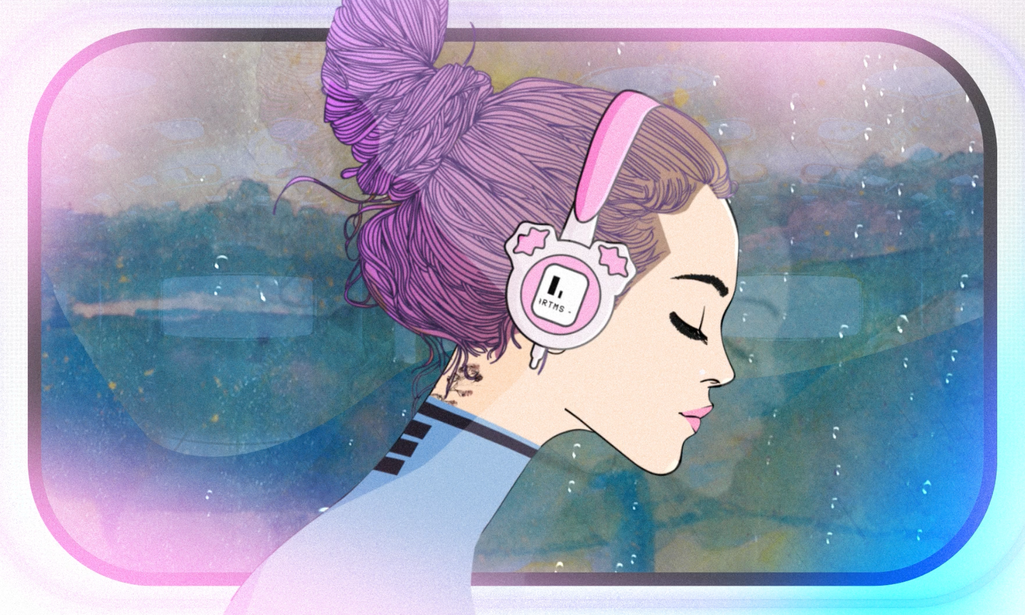
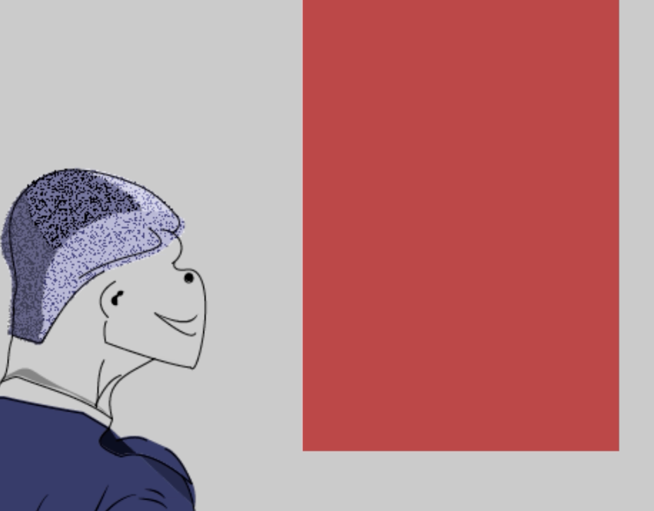
Na primeira página, “Welcome”, comecei por associar o ícone de perfil como head de uma fictícia “pasta de login”, característica que estabeleci através do mascaramento das outras informações, que seriam posteriormente reveladas junto ao movimento da barra de fundo inicial, a qual teria sua função modificada para botão de “Sign In”.
A intenção inicial foi estabelecer melhor comodidade e aconchego ao antigo usuário que retorna ao aplicativo e, para isso, além da associação “Welcome” - “Sign In”, as cores utilizadas buscaram relembrar o fundo da página, gerando descanso e um pouco de monotonia, traduzido como costume.
O fluxo da página segue até o surgimento do botão “Sign Up”.
Utilizando as cores propostas anteriormente pelo projeto, o botão Sign Up surge de maneira contrastante, como um elemento mais quente dentro de uma composição repleta de tons escuros, buscando estimular a adesão do novo usuário.
As informações dessa maneira parecem estar bem mais distinguíveis para o usuário.
[EN]
With the aim of improving the usability of a fictional interface created for studies managed by the
Layer Lemonade school, I made some changes to the organization of the interface during my studies. The main points being:
* Reduced use of animations, due to their directional nature.
* Restructuring the arrangement of information, in order to bring greater clarity to it.
* Modification of the application of colors, in order to generate a more engaged whole.
On the first page, “Welcome”, I started by associating the profile icon as the head of a fictitious “login folder”, a feature that I established by masking the other information, which would later be revealed along with the movement of the initial background bar, the which would have its function changed to the “Sign In” button.
The initial intention was to establish better comfort and comfort for former users who return to the application and, to this end, in addition to the “Welcome” - “Sign In” association, the colors used sought to recall the background of the page, generating rest and a bit of monotony, translated as usage.
The page flow continues until the “Sign Up” button appears.
Using the colors previously proposed by the project, the "Sign Up" button appears in a contrasting way, as a warmer element within a composition full of dark tones, seeking to encourage new user adoption.
The information this way appears to be much more distinguishable to the user.